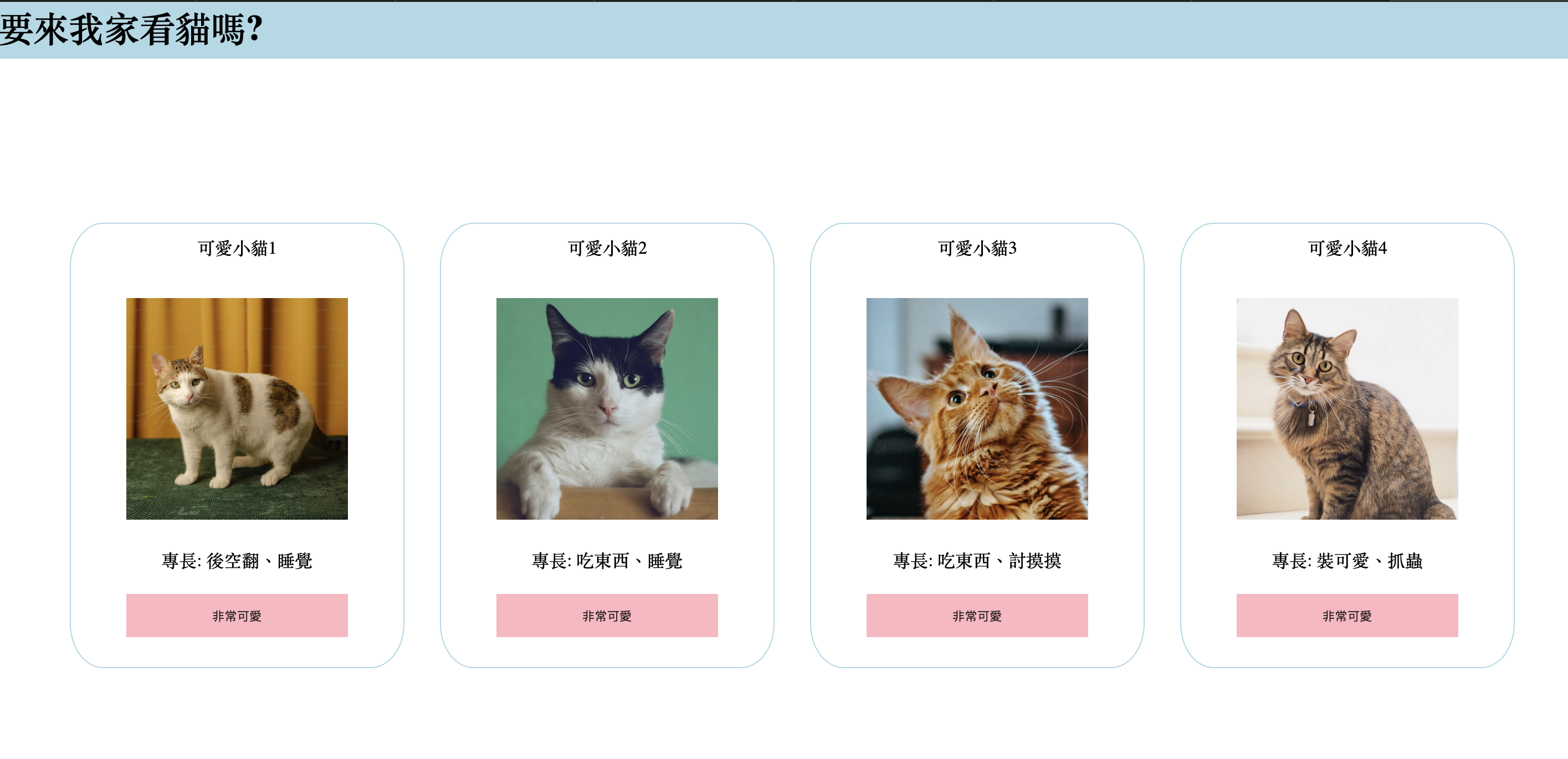
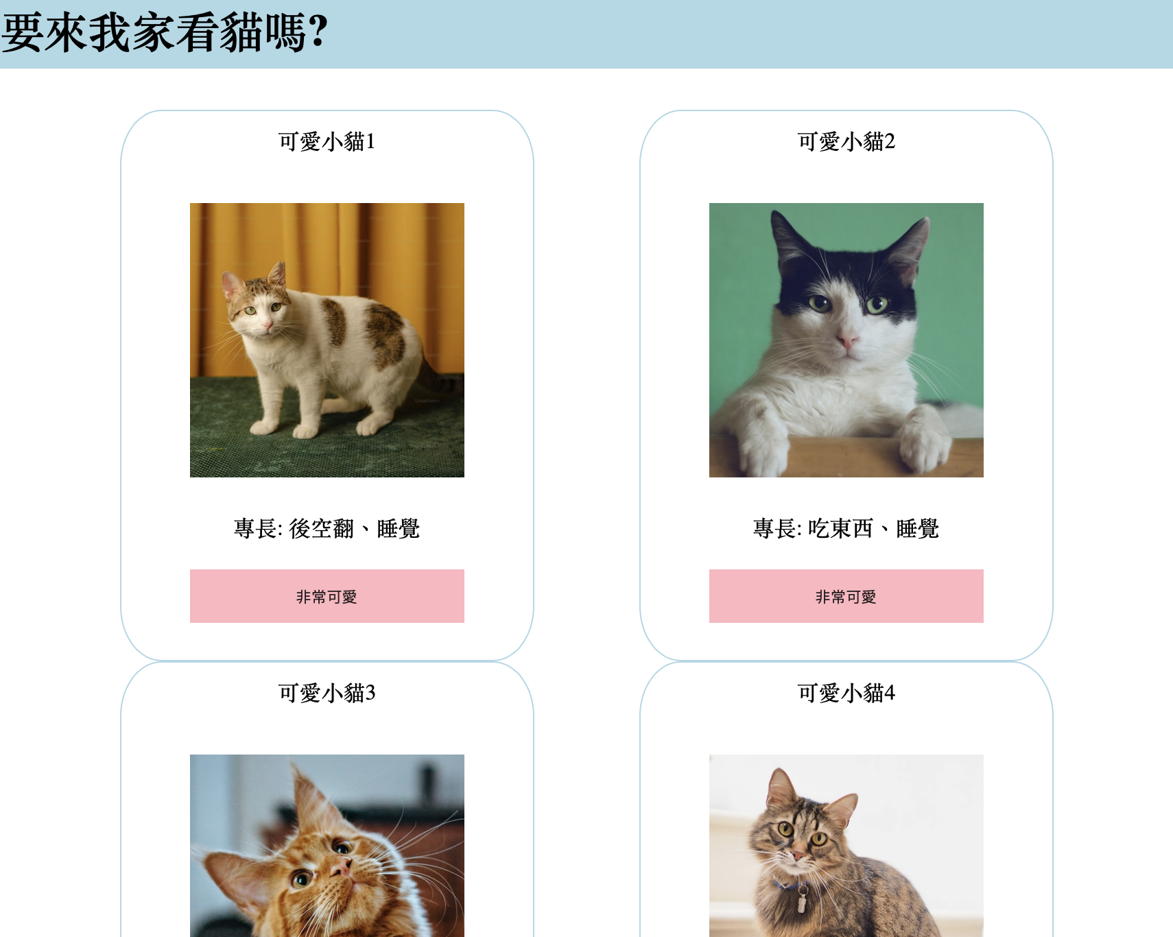
在udemy上學了html+css的知識,光看不會進步,動手做一遍才知道不熟的地方,我寫一個標題為要來我家看貓嗎的小網頁
切版架構
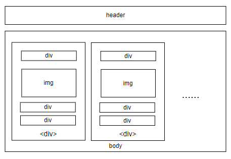
可以分成兩大區塊:
- header section
- body section
header section
html元素: 單純地用h1做大標題
css樣式設計:
- 整體div固定在最上方,並加上z-index讓body上滑不會蓋住它
|
|
body section
body部分以 display:flex 排列,並添加 wrapper 讓每行可以依照視窗大小改變容器數量
每個容器包含img,固定寬度200px
加上一些文字描述,和尚未引入javascript的button,其中有添加cursor樣式以及hover的pseudo element
為了讓文字與圖片置中排列於容器內,以position: relative 定位,使用 left: 50%; margin-left:-(img_width/2); 來置中
html元素:
- 區塊模板相同,每個div由上到下依序為標題div、圖檔img、文字div、以及按鈕button
css樣式設計:
- 整體body沒有加定位樣式,因此設margin-top來預防被header遮蓋
- 對於內部區塊模板,以flex呈現水平排列,並設定flex-wrap來允許視窗大小改變時,div能變成多行排列
|
|
- 針對區塊模板,給予寬度後設定
margin:auto來均分左右空間,border調整圓弧形
|
|
- 區塊內部的按鈕,加上鼠標移上去的偽元素樣式
|
|
成果展示
從下兩張圖比對,可以看到當螢幕尺寸改變,每行可容納的div數量也會彈性調整